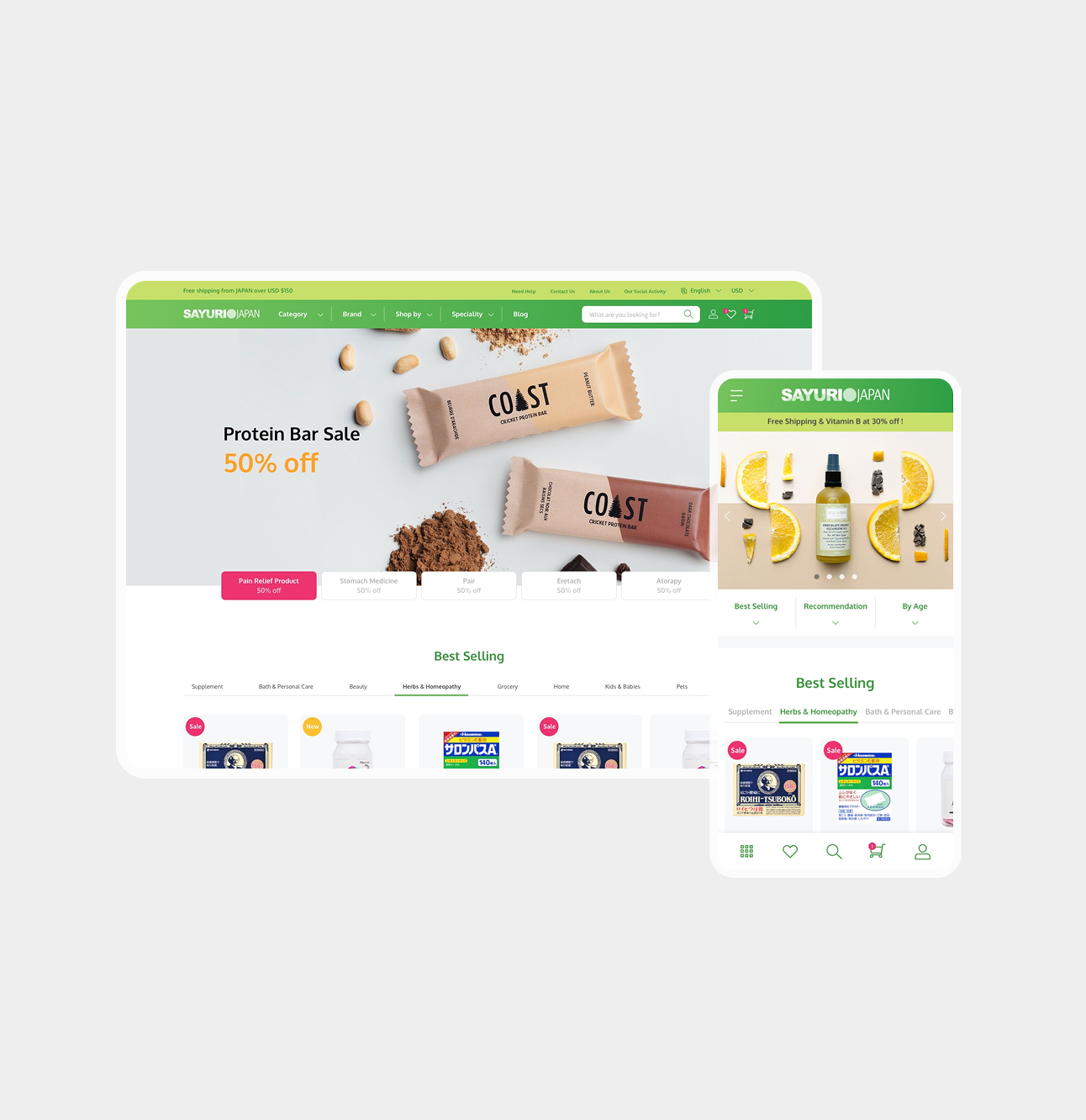
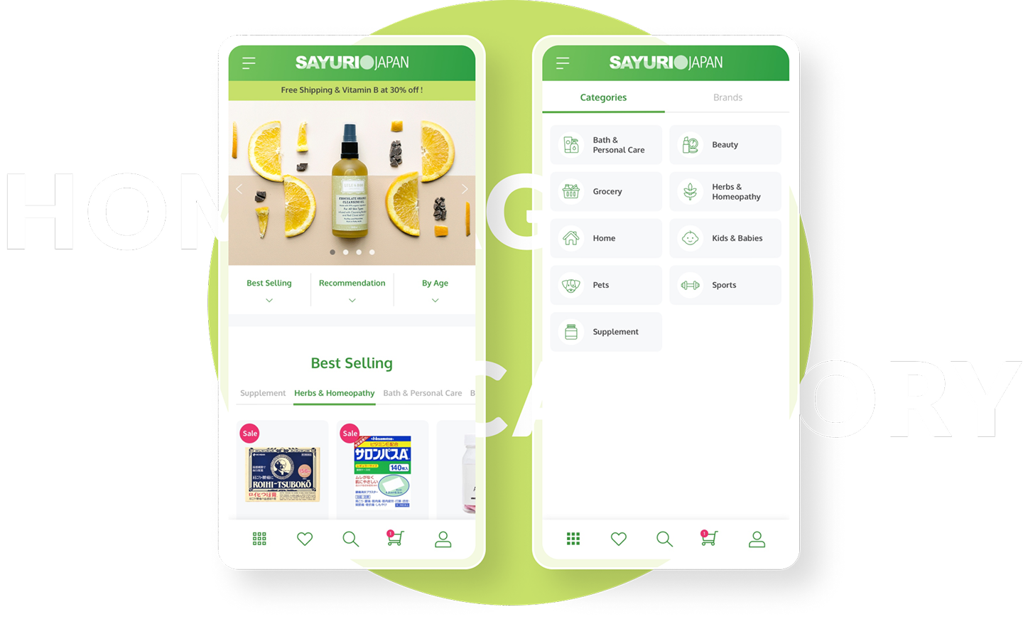
The Sayuri Japan storefront: the desktop homepage on a rounded card — a green navigation bar, a “Protein Bar Sale — 50% off” banner over two COAST bars, a row of category promotions and the start of a Best Selling grid — with the mobile homepage standing in front of it at the right.

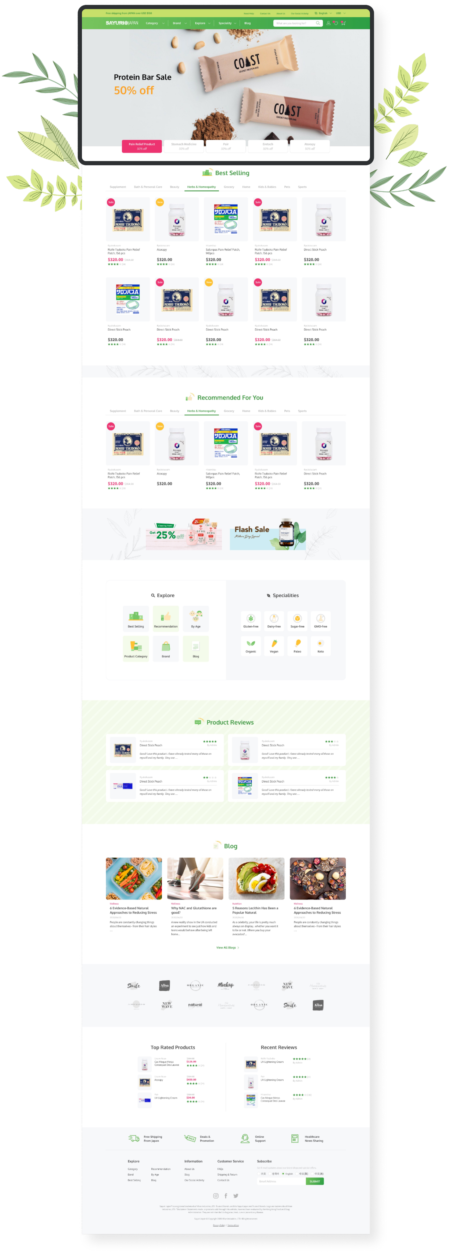
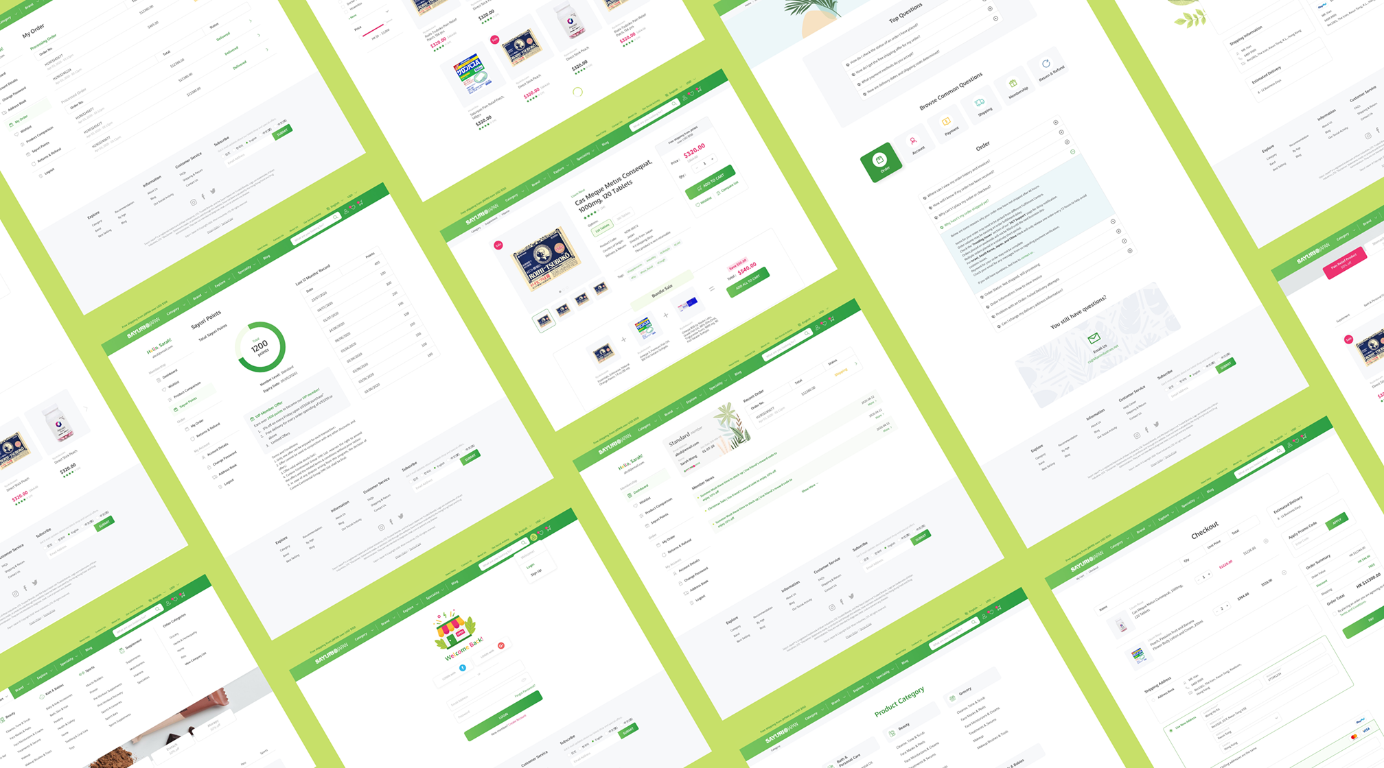
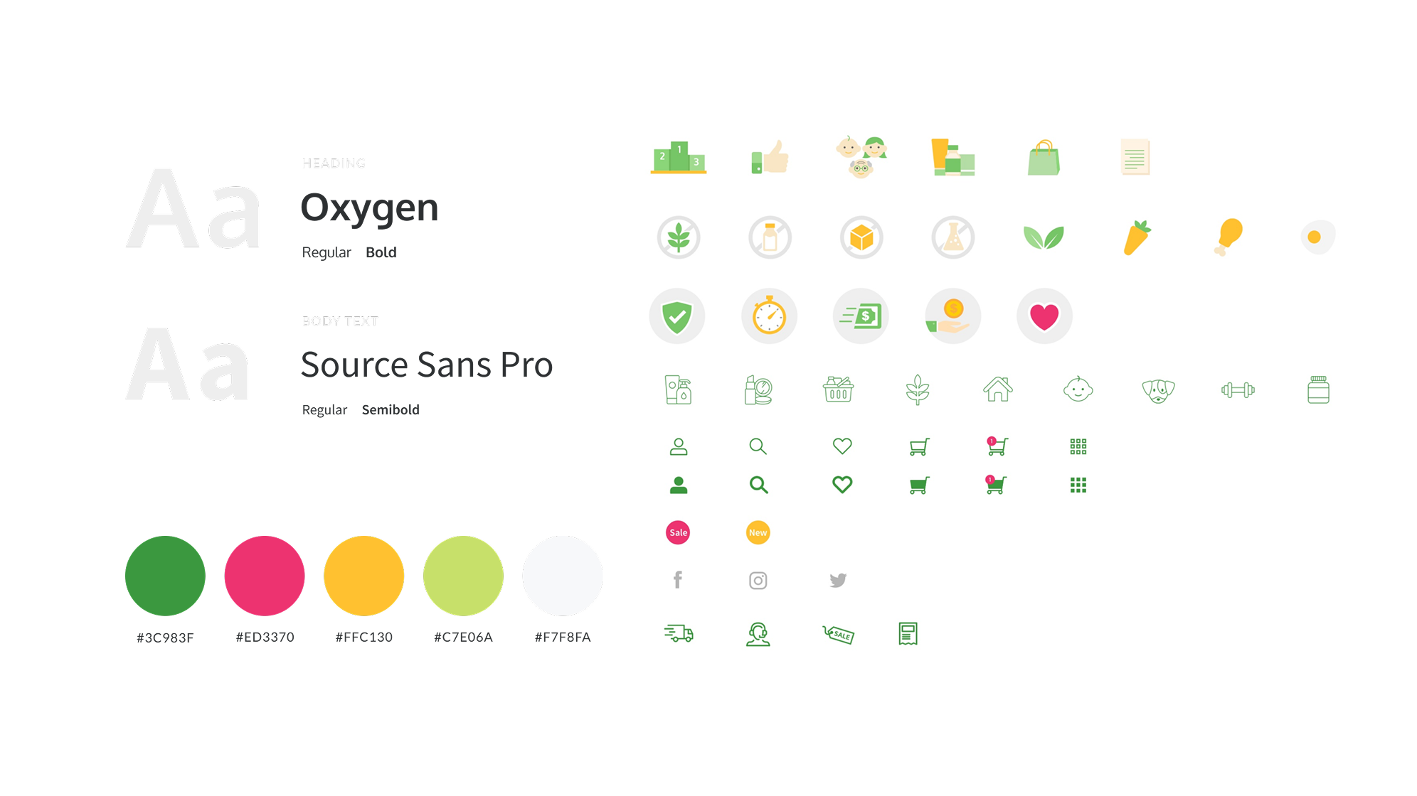
The desktop homepage as one long scroll, framed by olive-leaf decorations: a “Protein Bar Sale — 50% off” banner over two COAST bars, a row of category promotions, then Best Selling and Recommended For You product grids of Japanese supplements with sale badges, star ratings and prices. Around twenty of the site's pages tiled at an angle across a green field — category listings, product pages, checkout, order history, reviews, comparison tables and a rewards dashboard — showing the scale of the storefront. The UI kit: Oxygen for headings and Source Sans Pro for body text, each in two weights; a five-colour palette with hex values from deep green through pink, yellow and lime to off-white; and about forty line and filled icons for categories, delivery, payment and shop actions.