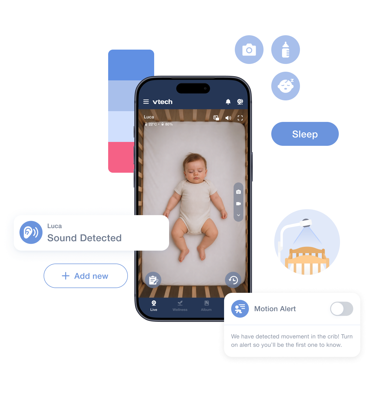
A phone showing the live crib view of a sleeping baby, ringed by pieces of the design system: a column of colour swatches, three round icon buttons, a blue “Sleep” pill, a “Sound Detected” notification, an “Add new” button, a crib illustration, and a “Motion Alert” card with a toggle.

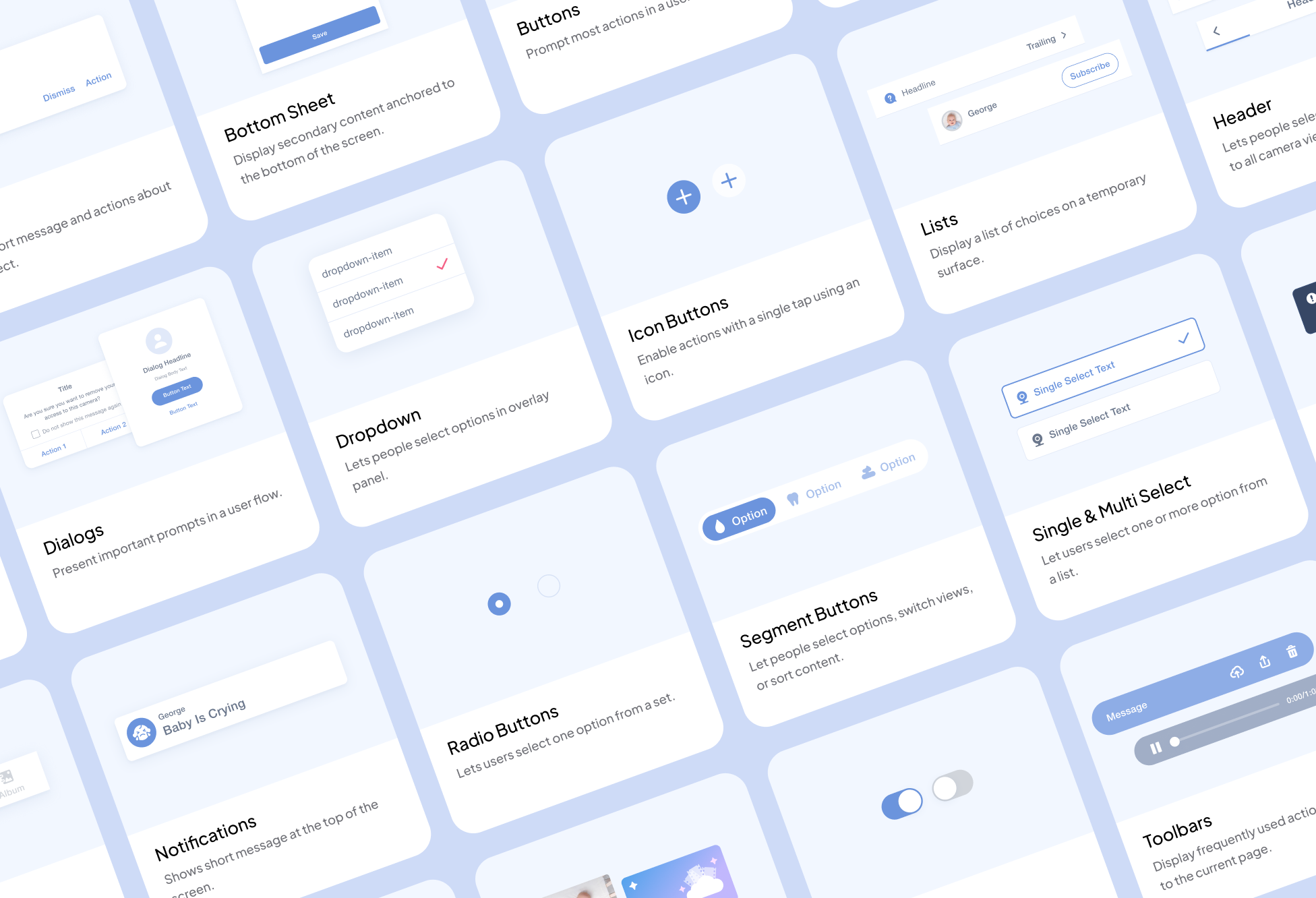
    The component library laid out as a tilted grid of labelled cards — avatars, banners, bottom sheets, buttons, dialogs, dropdowns, lists, headers, navigation bars, tabs, toggles and tooltips — each with a one-line description of what it is for.
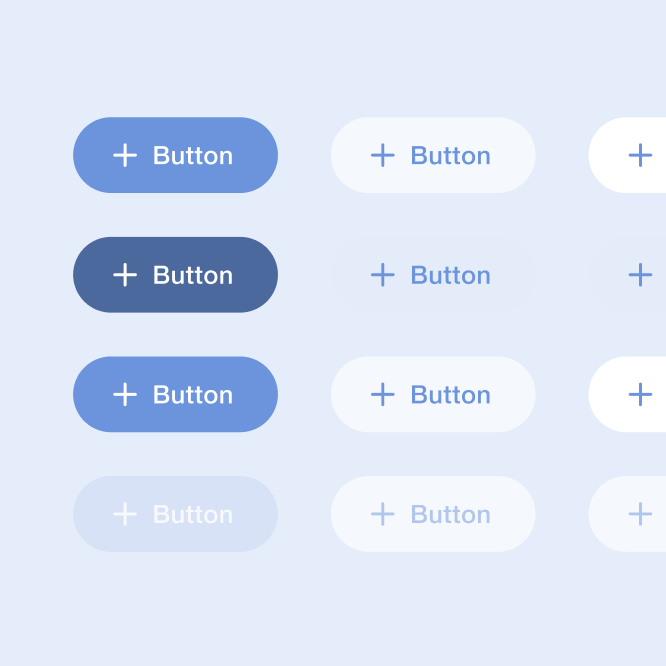
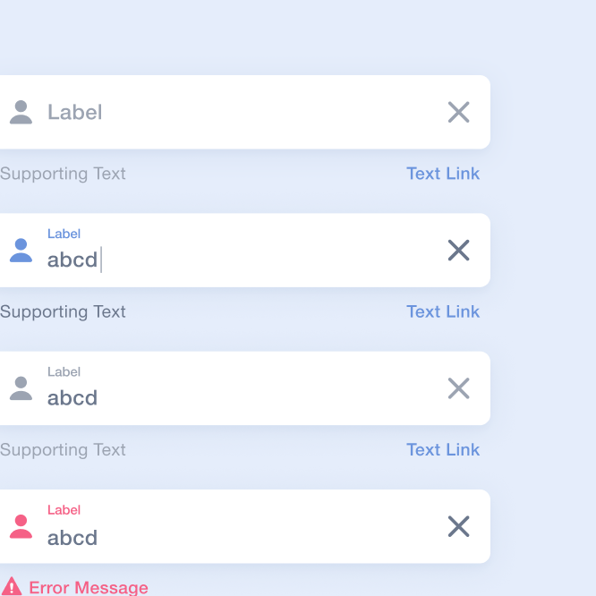
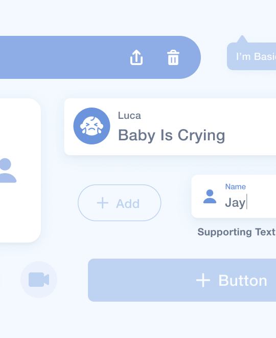
    A grid of twelve button components in filled, outlined and disabled states. Five stacked text-field components, each with a label, a value and supporting text.

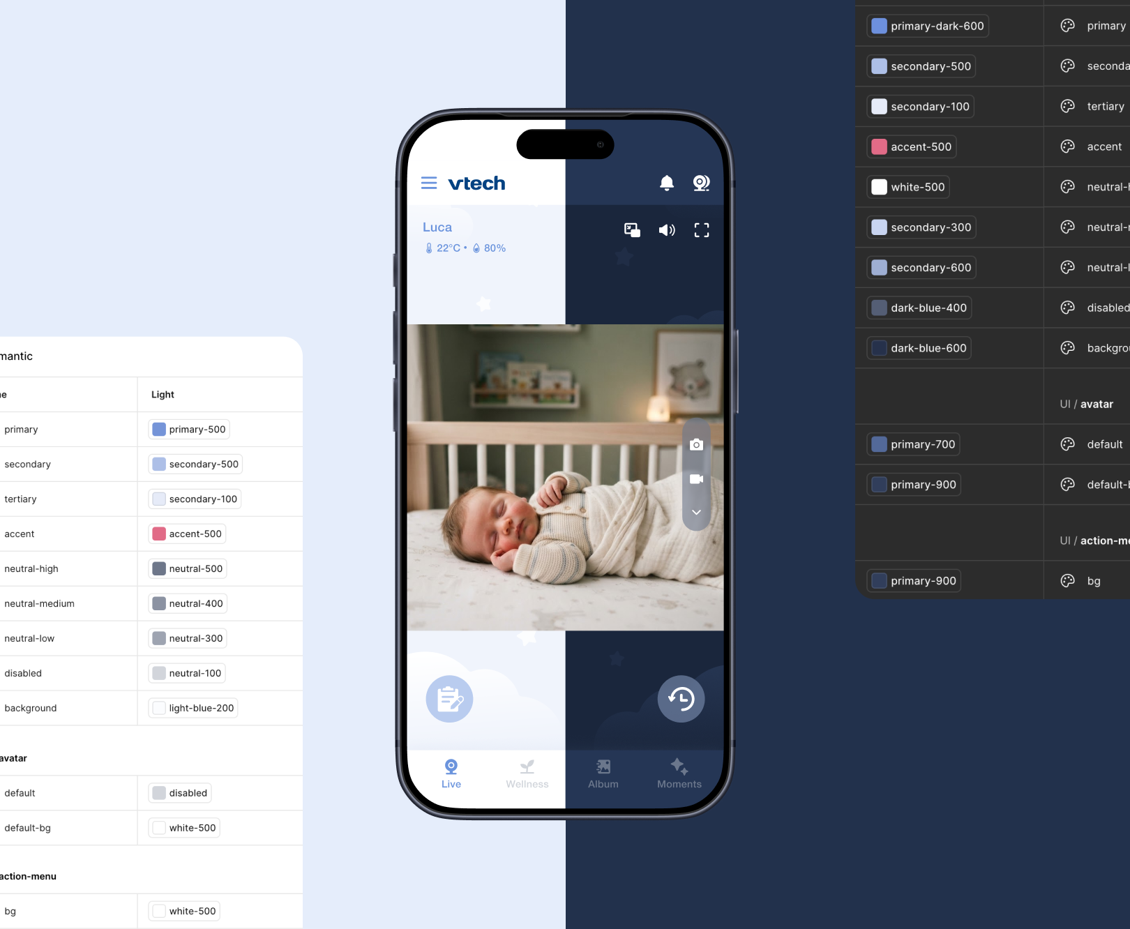
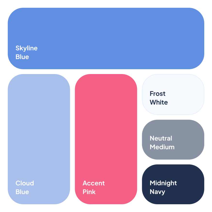
    One phone screen shown in light and dark mode at once, split down the middle, flanked by two spec sheets pairing each semantic colour role with its light and dark token. A palette card naming six colours: Skyline Blue, Cloud Blue, Accent Pink, Frost White, Neutral Medium and Midnight Navy.

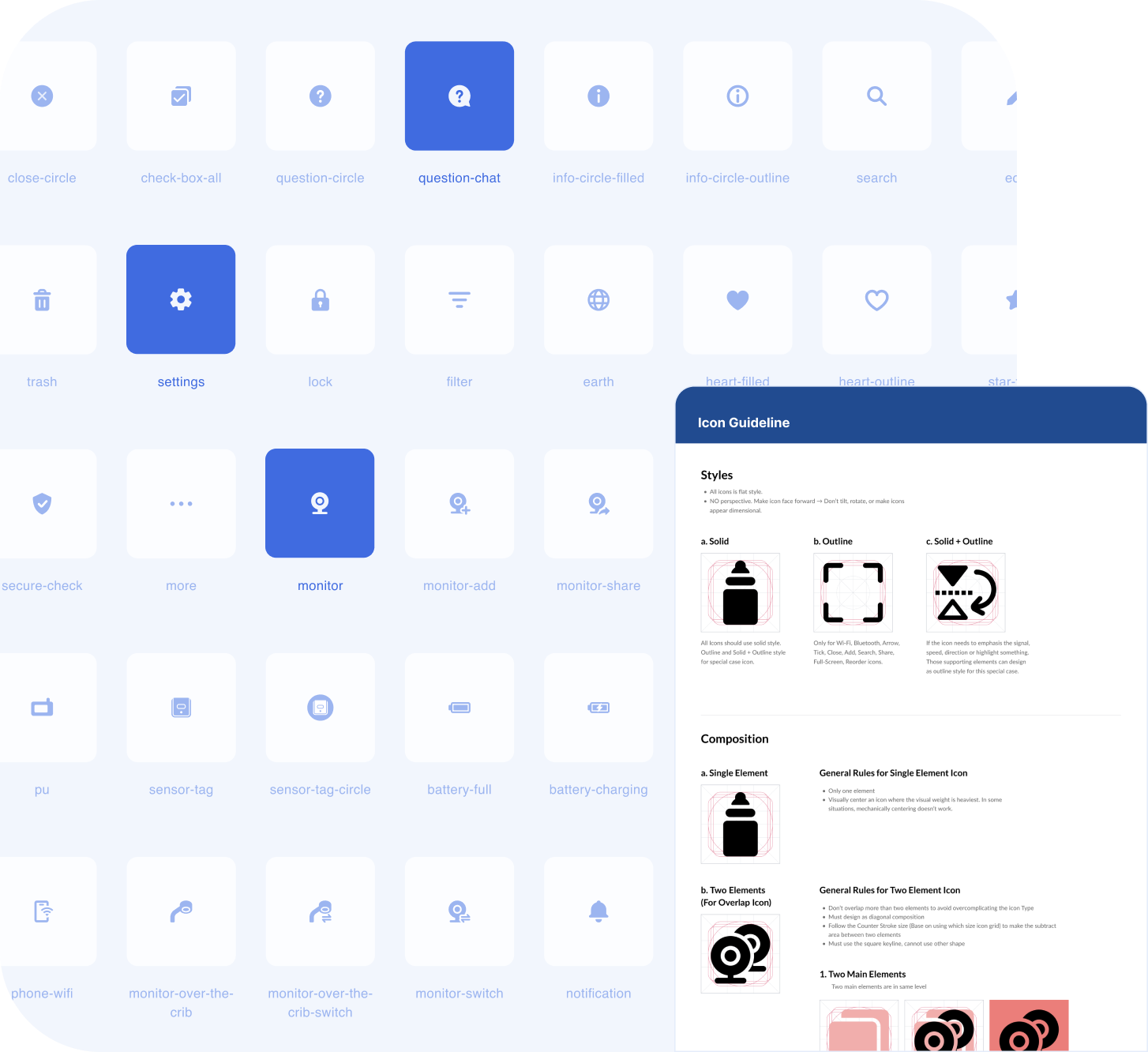
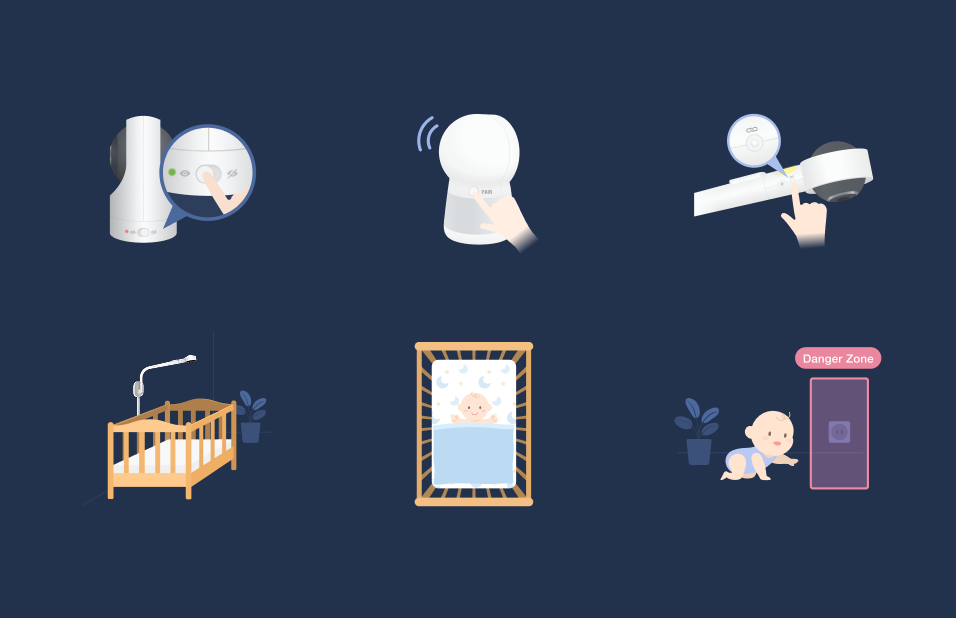
    A grid of line icons with their names beneath — close-circle, settings, monitor, battery, notification and dozens more — with an “Icon Guideline” sheet overlapping it setting out stroke and composition rules. Six illustrations on a midnight navy field: a bottle, a swaddled baby, a hand adjusting a camera, a crib, a framed photo and a baby beside a phone. Fifteen illustrations on a pale blue field sharing one baby character and colour theme — a pregnant figure, a swaddled newborn, a crib, a teddy bear, cameras, a cloud and a gift.